Dallas Public Library
📚 Re-envisioning responsive layouts that enable mobile users to easily browse media, events, and locations
See design flats / See desktop prototype / See mobile prototype


OVERVIEW
A space for learning & community
The Dallas Public Library website connects visitors to a wealth of services, from borrowing books to free online courses. The website also informs visitors about upcoming events at the libraries, like family activities, financial planning, and voting.
The Problem
Visitors find the website difficult to navigate due to its cramped resolution, inconsistent typography, and disorganized layouts. The site is only partially responsive, making it hard for mobile users to engage with content.
The Solution
Refresh the website with cohesive layouts and clear navigation, enabling visitors to easily find information in their preferred language and platform.
Impact
- Enabled easy browsing for mobile users through a responsive layout
- Consolidated three disparate layouts into a unified design
- Simplified the typography by reducing the nine original fonts to a unified pairing
- 100% of usability participants appreciated the updated layout, noting that information was easy to find
- 90% of participants appreciated the integrated map feature and its ease-of-use
- Participants who spoke non-English languages valued the multilingual options
DISCOVERY
Understanding library visitors
Usability Test
I first tested the website to identify key features and pain points. I guided five diverse participants through the Home, Catalog, Events, and Hours & Locations pages. While they liked the content, they expressed an overwhelming negative reaction to the navigation and layouts. One participant noted:
“Sometimes when information is laid out like this, you wonder if the website still works.”
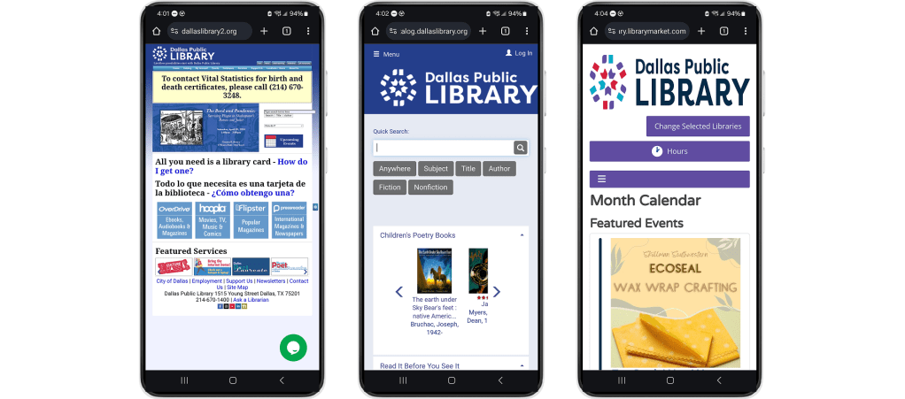
Three disparate layouts
Participants were frustrated with finding information because of the inconsistent layouts.
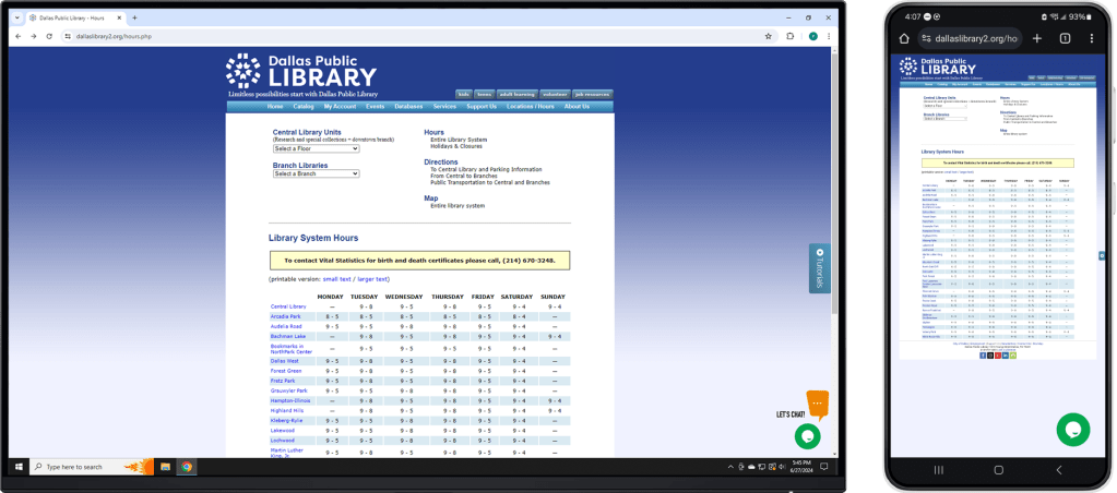
Unresponsive table
Participants had difficulty discerning library locations because of the small cluttered text.
Desk Research
I then consulted primary source articles to explore demographic information about Dallas residents, library visitors, and the devices they use. A notable intersection is that lower-income residents often likely to rely on smartphones for internet access and place high value on library services.
The desk research coupled with the usability test enabled me to identify user needs:
- Clear navigation – Visitors need to easily find information like library hours and locations.
- Modern & unified presentation – They need the website to be engaging and cohesive across different pages.
- Responsive layout – Visitors, especially those who only have access to a phone, need a functional mobile layout.
- Multilingual support – They need information to be available in their preferred languages, such as Spanish, Chinese and Vietnamese.
DESIGN
Brainstorming solutions
Comparative Audit
To explore possible solutions, I evaluated other library/bookseller websites in a comparative audit. They share common elements, such as a navigation bar on desktop, hamburger menus on mobile, and multi-lingual support.
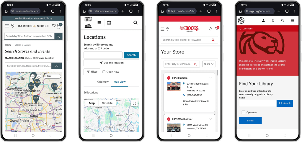
Comparative websites also provide enable visitors to find locations by interacting with a map or entering their city or zip code
Low-fi Prototype
Referring to the user needs and design patterns from other library websites, I crafted low-fidelity mobile and desktop prototypes with key features:
- Layouts that are responsive for desktop and mobile
- Cohesive grouping of related content
- Expanded screen space; unified and modernized presentation
- Dropdown menu to switch languages
- Location search with an interactive map


TESTING & ITERATIONS
Providing more context for locations
I conducted 4 rounds of usability tests and iterations for the desktop and mobile prototypes, each with five participants of diverse ages and languages. Overall, participants found the experience to be straightforward but felt confused when navigating Hours & Locations. I improved on these areas in the high-fidelity prototypes.
Visitors need more context for the pins on the map.
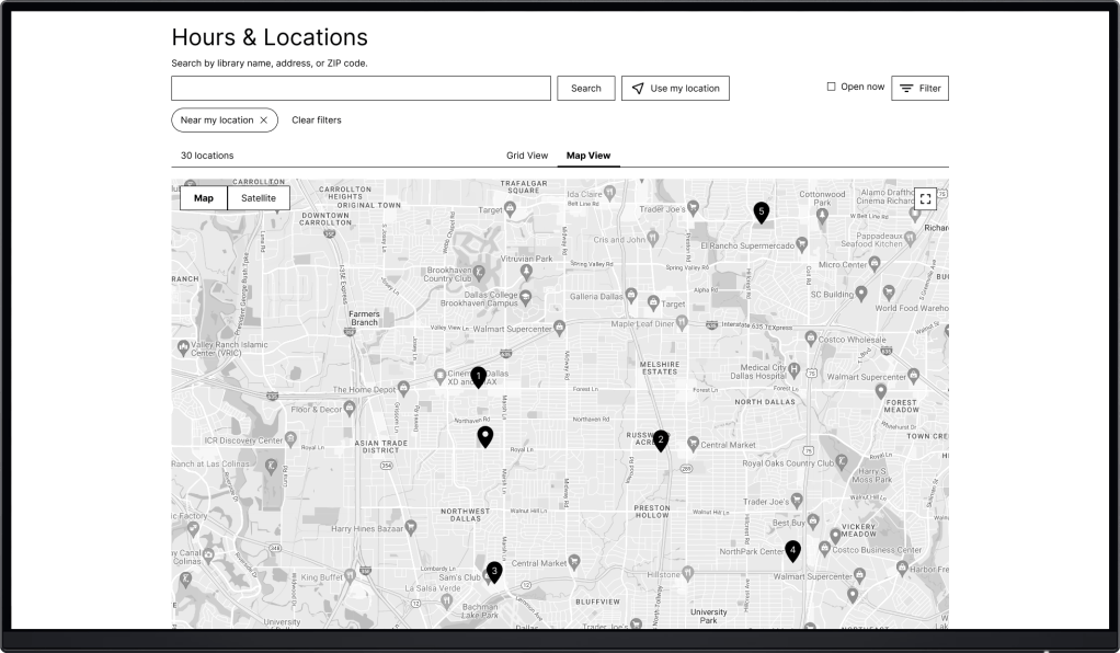
Problem
2 participants felt lost by the lack of context for pins on the map.

Solution
A numbered list of locations with details correlates with the pins on the map.
Visitors need to find locations more quickly and conveniently.
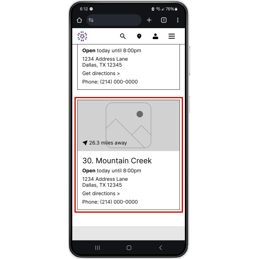
Problem
3 participants found List View to be too long. Each location card occupies sizeable screen space.
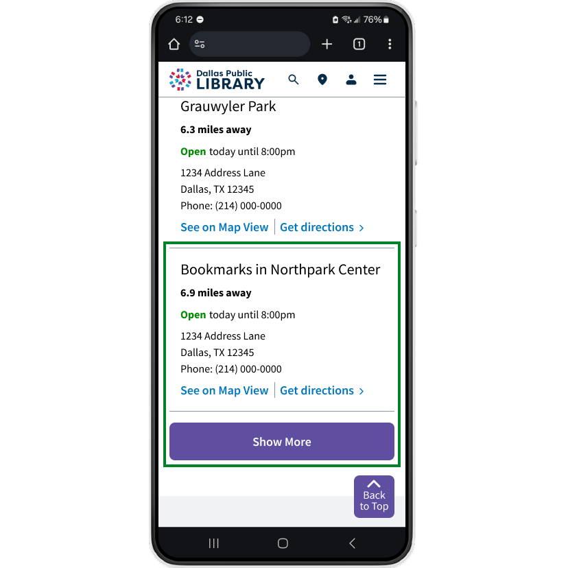
Solution
Without pictures, each card occupies less space. A Show More button reveals cards in increments of five.
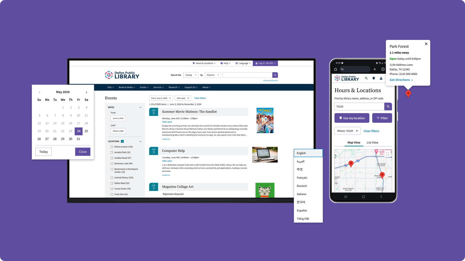
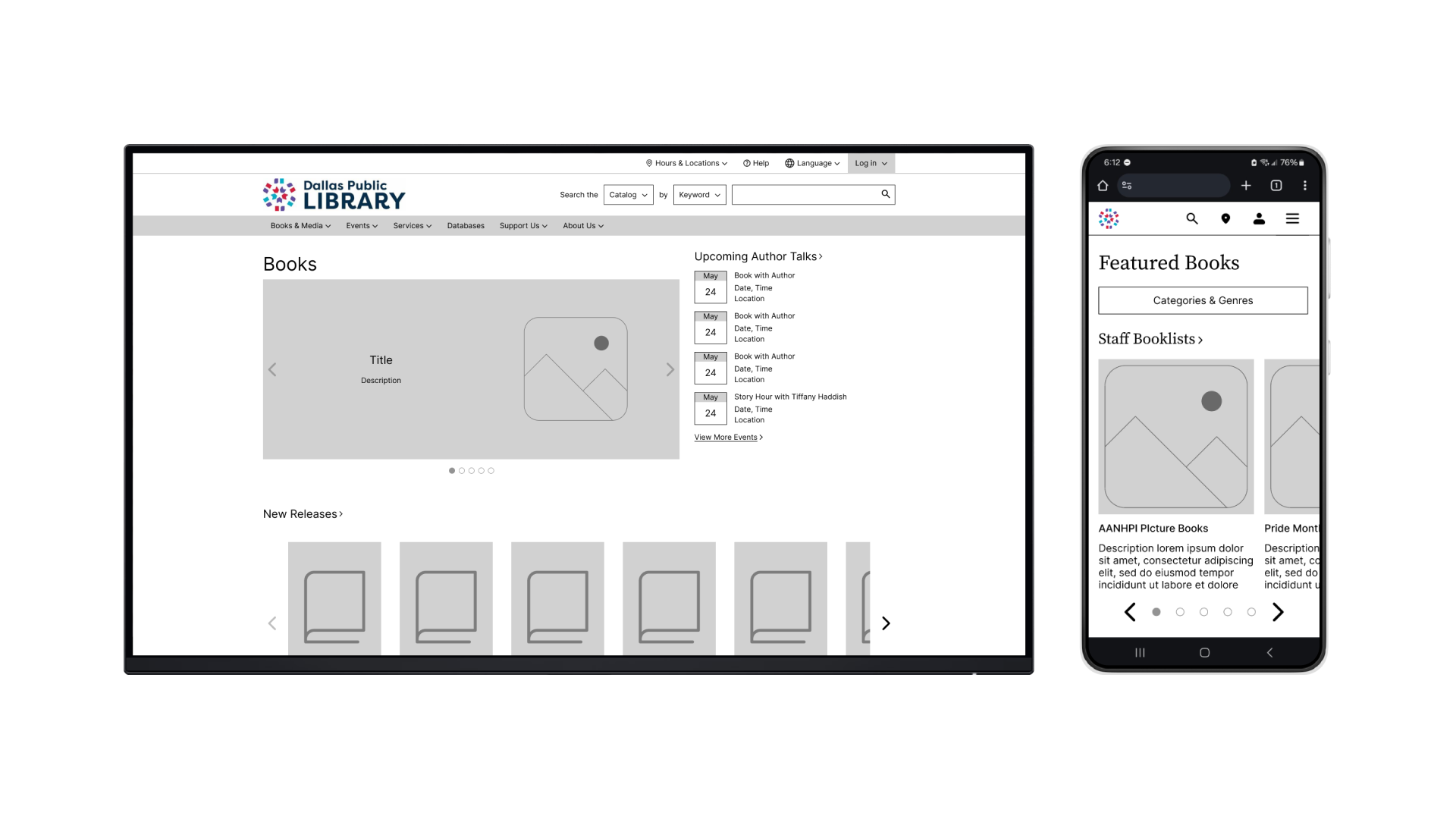
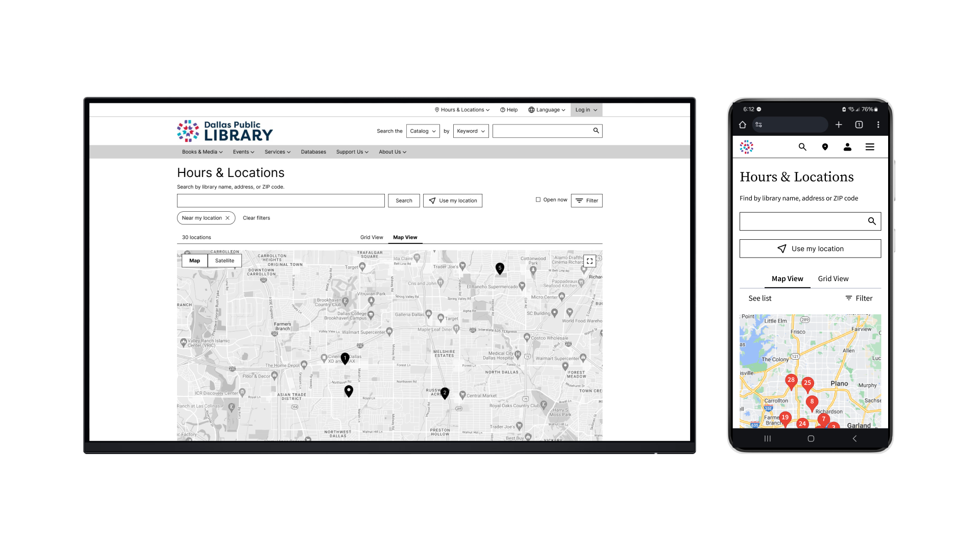
FINAL DESIGNS
A streamlined & cohesive experience
With a cohesive layout, streamlined navigation, and clear presentation of content, the redesign empowers visitors to easily find the information that they need. See design flats.
Visitors can quickly find a library via the map or by entering a location.
Prominent filter options enable visitors to easily browse events.
REFLECTIONS
Guided by feedback
I improved the user experience and navigation across four key pages. Close observation of other library websites and usability participant feedback was essential for improving each iteration. Looking back, I would change my approach from page-level improvements to streamlining a specific user flow, such as looking for an event and its location. This approach would focus on more specific user needs and illustrate a visitor’s real experience for stakeholders.
 Yihyoung Li