CANVAS
🏓 Designing an e-commerce prototype where customers can personalize their pickleball paddle colors
OVERVIEW
An opportunity for elevated personalization
The Challenge
Although the market for pickleball paddles is growing, customers have few sophisticated tools to personalize their paddles.
The Solution
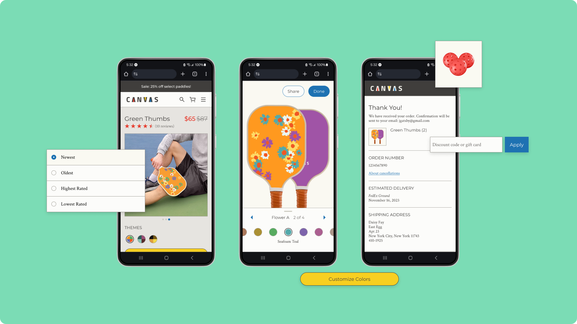
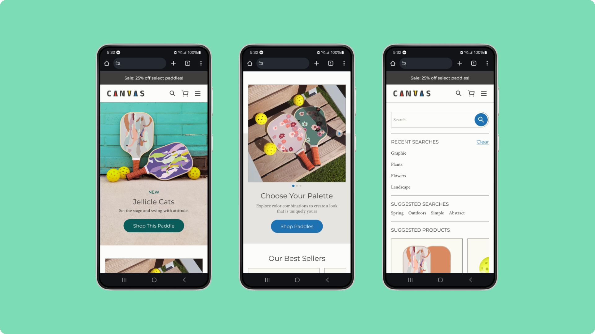
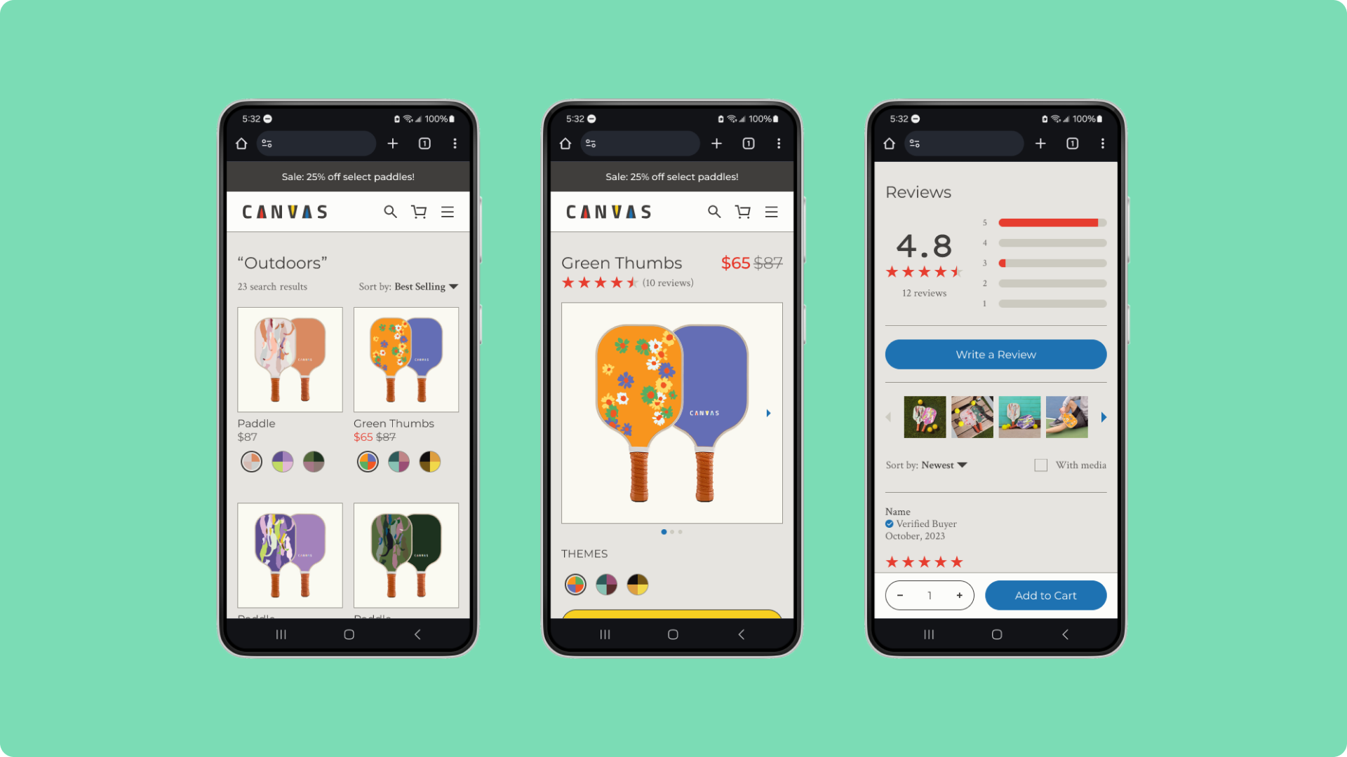
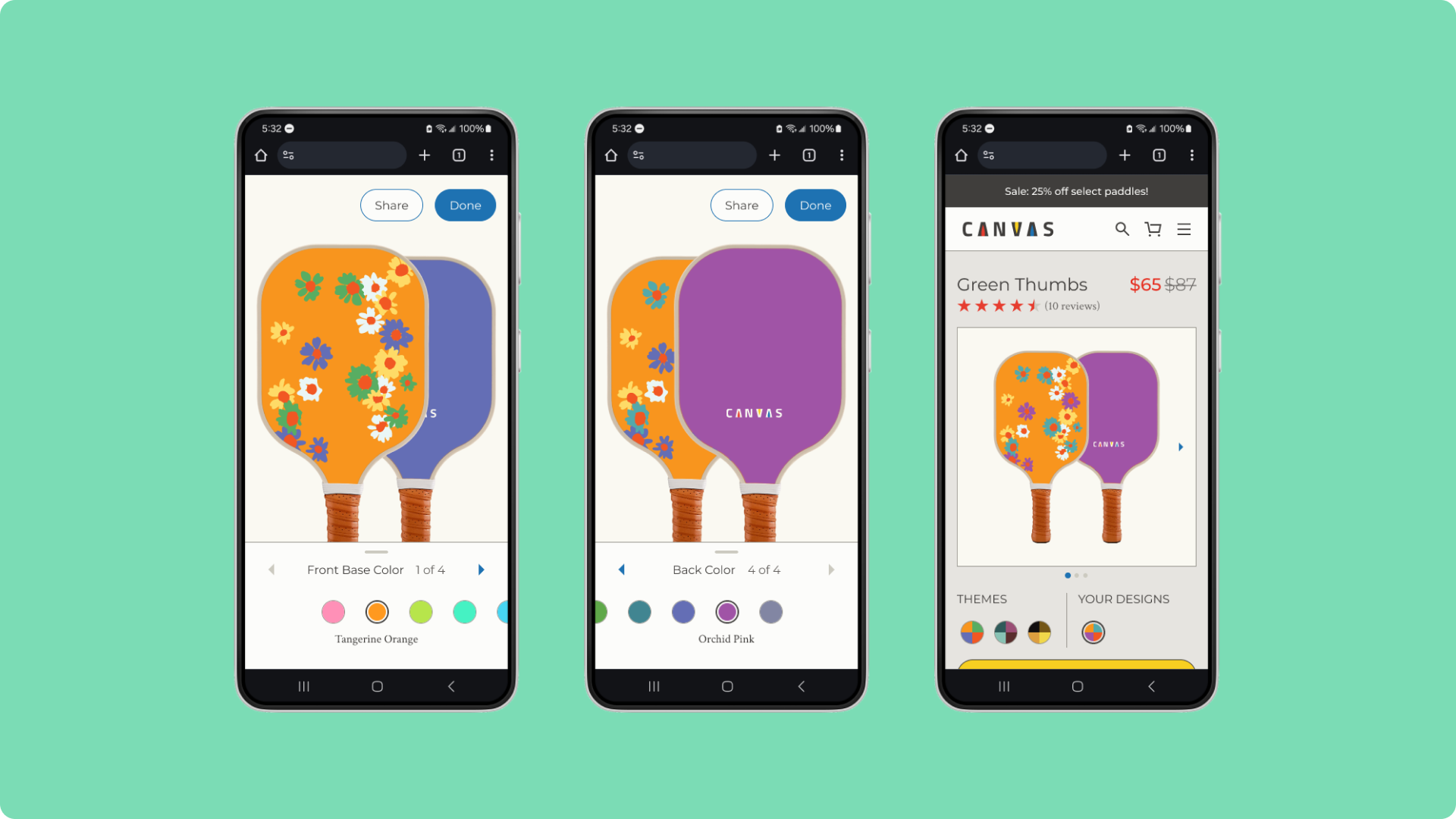
Canvas offers a guided customization tool, enabling customers to choose from a variety of colors for their paddle.
Impact
- 100% of usability participants felt comfortable with the browsing and checkout flows.
- 80% of participants felt confident with the paddle customization tool.
DISCOVERY
Exploring customization tools
Competitive Audit
I evaluated e-commerce platforms which sell pickleball paddles or which include customization tools. While competitors shared similar ways to browse and purchase paddles, there were few tools to customize paddles, revealing an untapped opportunity.
Zazzle enables users to customize a variety of products through a free-form graphics editor.
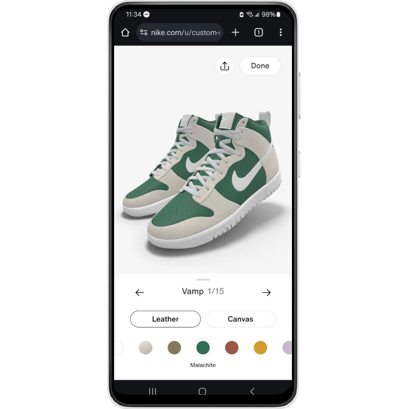
Nike By You enables color and materials customization of its branded shoes through a guided sequence.
Desk Research
I then researched target users—pickleball players and customers interested in customizable products—which revealed interest across age and gender. The desk research coupled with the competitive audit uncovered key insights:
- Diverse audience – Customers need paddle designs that appeal to a wide range of ages and genders.
- Simple and inspiring customization – They need a tool that is easy to use but also expressive.
- Integrated within the e-commerce flow – They need the tool to be seamless and dynamic while browsing and buying items.
DESIGN
Brainstorming solutions
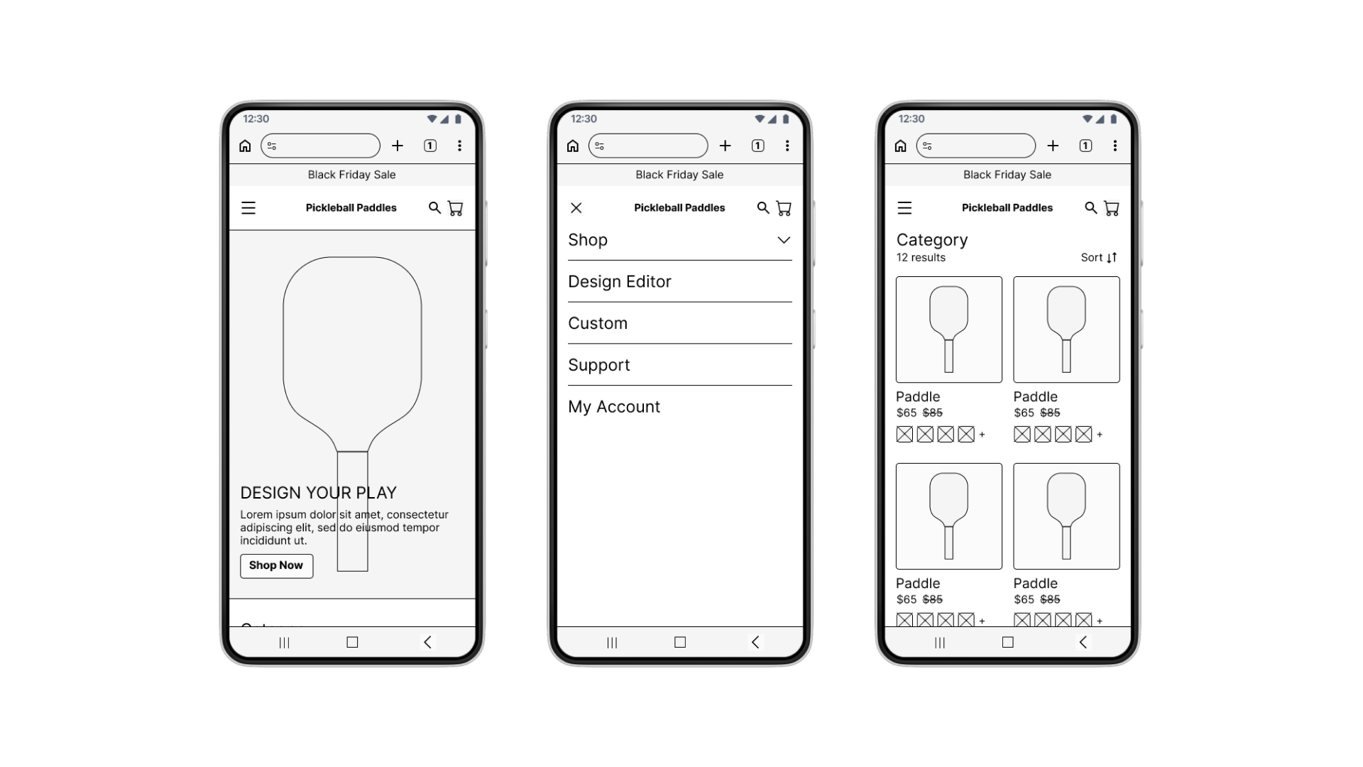
I crafted initial low-fidelity designs by closely referencing the platforms from the competitive audit. I incorporated familiar e-commerce elements such as pages for product listings, product details, and checking out. Unclear on what kind of customization tool users would prefer, I sketched a free-form option with many features for participants to test.
TESTING & ITERATIONS
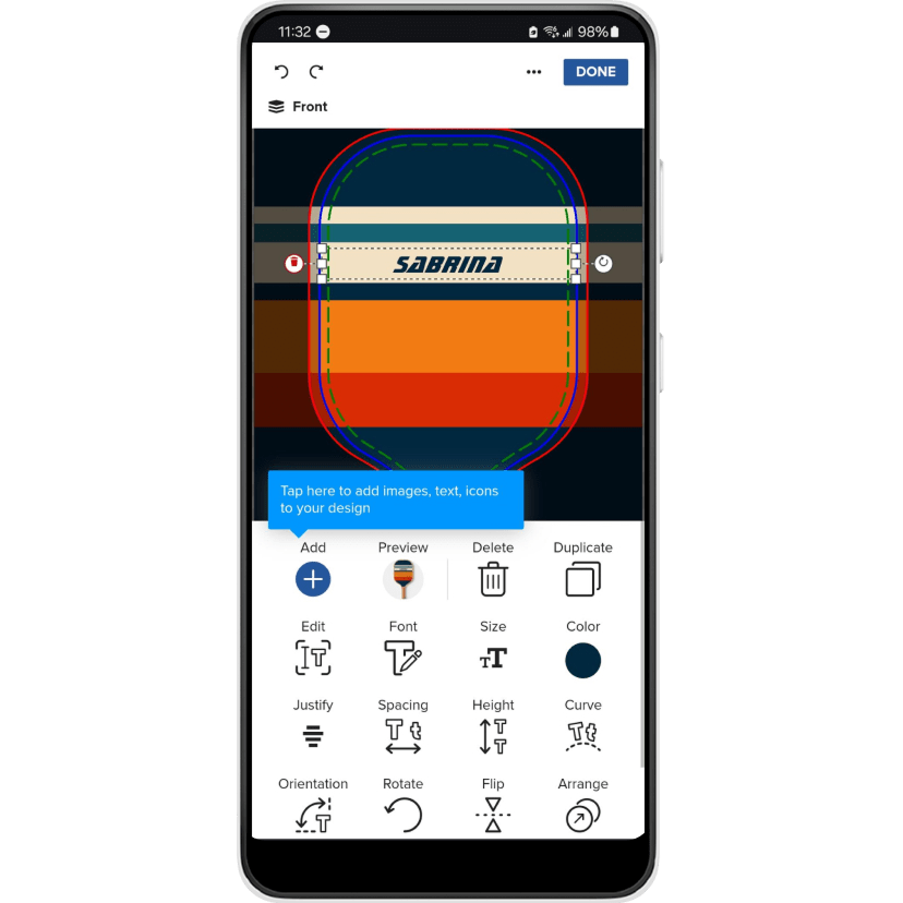
Simplifying the customization tool
I ran four rounds of usability testing, each with five participants of diverse genders and ages. Participants found the e-commerce flow to be straightforward but were confused and frustrated with the complicated customization tool. I addressed their feedback after each round by refining the designs.
Customers need the customization experience to be simpler and sequential.
Problem
In early iterations, participants felt overwhelmed and disoriented by too many features and lack of guidance.
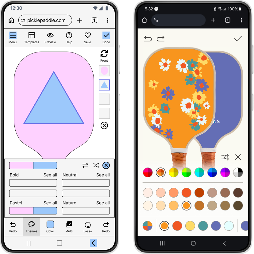
Solution
The tool is simplified to a color-selecting experience with guided visual cues like arrows, labels, and animations. 80% of participants felt confident with the improved experience.
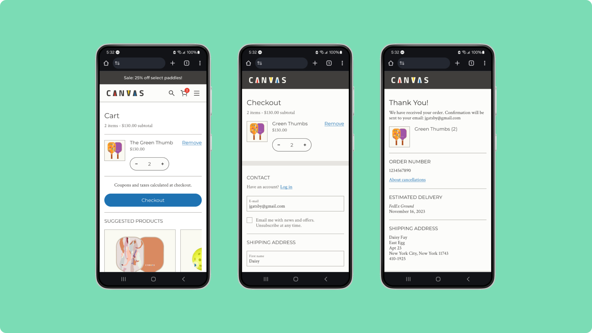
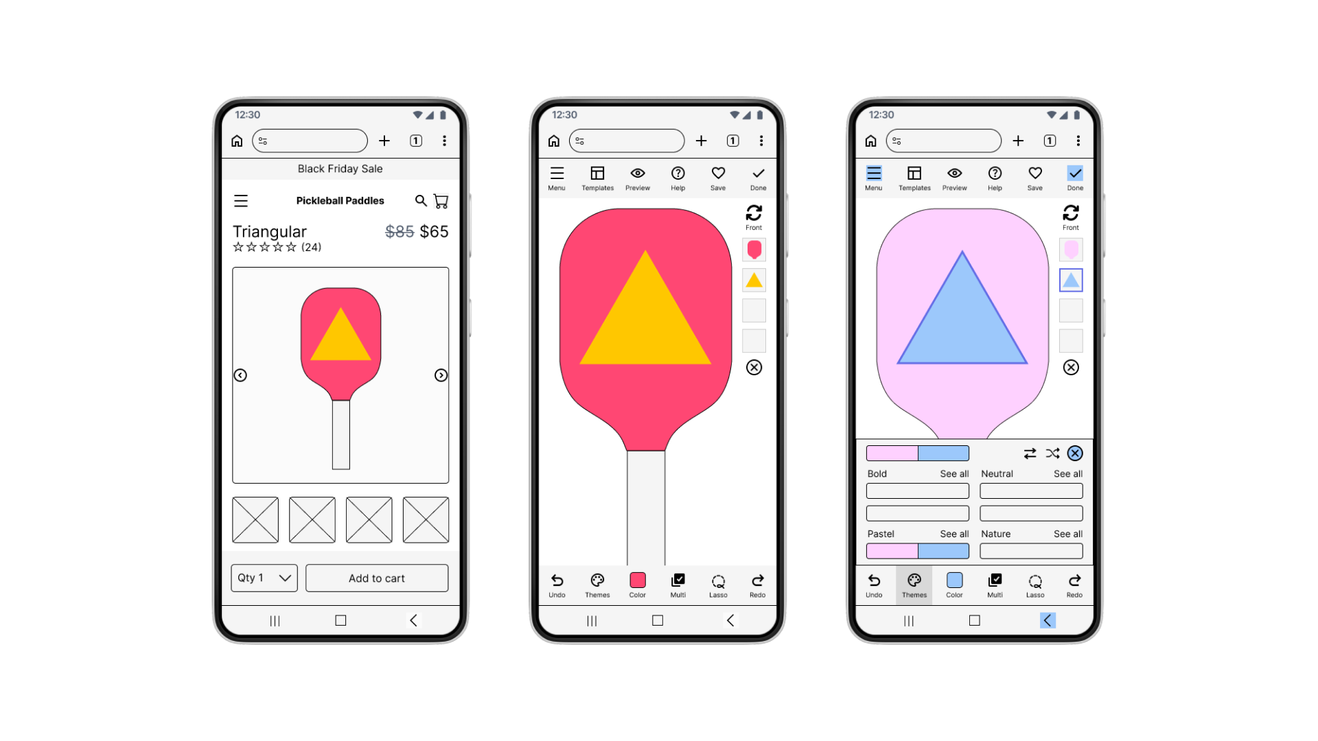
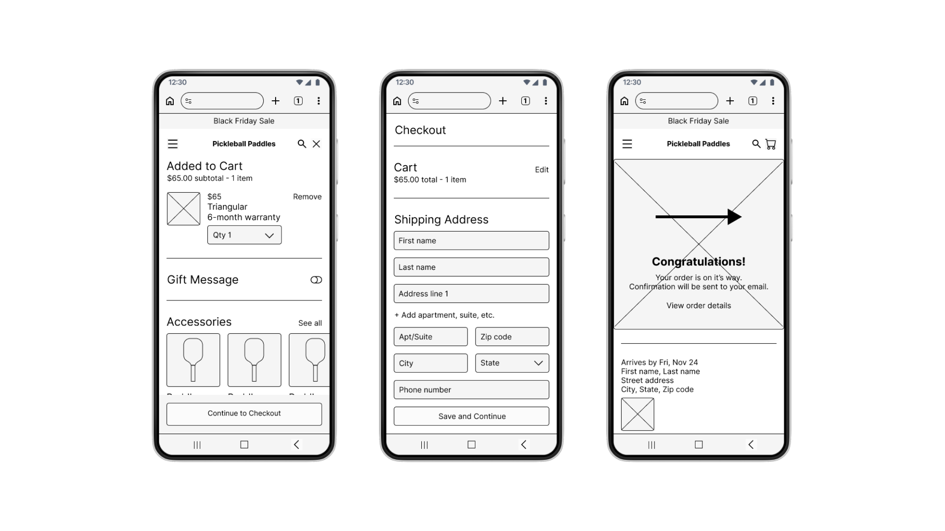
FINAL DESIGNS
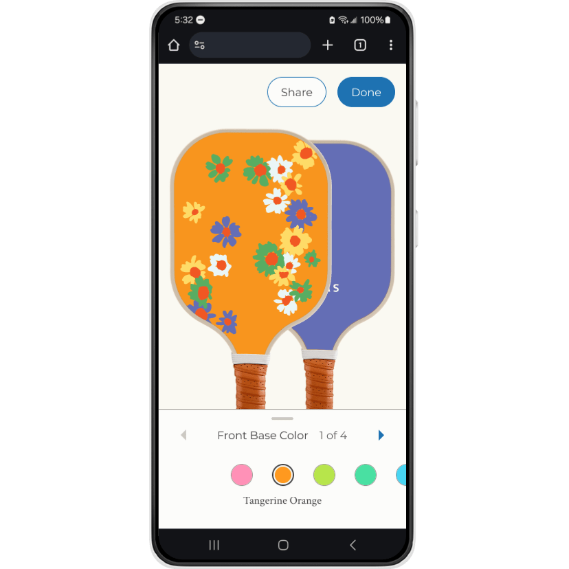
An easy step-by-step experience
The customization tool and e-commerce experience are straightforward to use and dynamic, with clear guidance that helps customers with their choices. See design flats
Prominent visual cues enable customers to quickly understand the tool.
Customers can choose their preferred payment and shipping methods.
REFLECTIONS
Next time, first clarify user needs
Looking back, I would better clarify the needs of my users: what kind of customization best supports their goals? Open-ended tools like Zazzle are built for creators who intend to sell their designs, whereas guided, brand-led tools like Nike By You cater towards customers for personal use—the approach that aligned with my users. Identifying this distinction earlier would have sharpened my initial decisions.
